
- Recipes4Resumes
- Best Fonts for your Resume
Best Fonts for your Resume
What are the best fonts for a Resume?
The right font makes your Resume stand out in all the right ways.
Experts say it takes 6 -10 seconds (or less) for a hiring manager, or recruiter to decide if your Resume is a keeper, and the font size and style you choose will have a major impact on that decision. A font that in any way makes your Resume hard to read or look unprofessional will land it quickly in the trash pile. You could be the most competent candidate, but you'll be out of the running from the beginning if your Resume can't be read properly. To help ensure that your qualifications are the main focus and not your font choice, here are some reliable Resume font rules that you should know and follow.
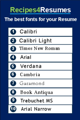
What are the best fonts for your Resume (and why)?
Calibri is first on the list as the best Resume font because it's more professional and modern looking than most of the other choices, which makes it ideal for a Resume. It's spaced well, clean, and easy to read.
More importantly, it can be readily deciphered by Applicant Tracking Systems (ATS), which means the software will see text and not little boxes or symbols on your uploaded document.
On this same note, your Resume may be printed out on paper before it's reviewed. Again, Calibri, Arial, or even Tahoma is the best Resume font and looks the most professional and are easiest to read when printed.
What is the difference between a serif and a sans-serif font?
The difference between serif and sans-serif fonts is in the names themselves—serif fonts have decorative elements known as a serif, and sans-serif fonts do not.
Serif fonts that you can use on a Resume include:
• Garamond
• Times New Roman
Sans-serif fonts you can use on a Resume include:
• Calibri
• Tahoma
• Arial
• Helvetica
For Resumes, we generally recommend using a sans-serif font, instead of a serif font. Sans-serif fonts are easier to read on digital devices, especially smaller screens—and nowadays, many recruiters are reading Resumes on the go or on their phones. Sans-serif fonts are not only easy to read when printed, but they also are less taxing to read at smaller sizes on smaller screens. Sans-serif fonts also convey a modern and fresh look that help prevent your Resume from looking dated.
What fonts should you avoid on a Resume?
Avoid using flowery, themed, or “fun” fonts, like Comic Sans and Impact or cursive fonts such as Freestyle Script and Segoe Script.
Along with being difficult to read and not compatible with an ATS, “artistic” fonts tell employers that you don't know the rules of creating a professional Resume, which could potentially lead them to think you don't take your job search seriously. Remember, no snazzy Resume font will showcase your qualifications as clearly as your job experience, talents, and accomplishments.
What is the best font size to use for a Resume?
Generally, a 10- to 12-point font size is recommended. A good rule of thumb to remember: Don't decide on a font size until you've chosen the specific font you'll use for your Resume. This is because some fonts like Calibri and Trebuchet MS, take up less space than Times New Roman or Verdana. Depending on the font, you might be able to slightly reduce or slightly increase its size to have the two-page Resume that recruiters like while still ensuring it's easy to read and the format is pleasing. However, going above a 12-point font in the Resume body to make two pages means you probably need to add more details about your past responsibilities and achievements or include skills developed from voluntary work and hobbies.
If you're submitting your Resume online, you also might need to use a 12-point font size throughout and eliminate any formatting, like underlining, italics, or bolding. Online programs often convert your information to an ASCII format, or ask you to use an ASCII format so the Resume displays correctly, and a 12-point font works best.
Is a 10-point font too small for a Resume?
Generally, a 10- to 12-point font size is recommended. A good rule of thumb to remember: Don't decide on a font size until you've chosen the specific font you'll use for your Resume. This is because some fonts like Calibri, Trebuchet, and Arial Narrow take up less space than Times New Roman or Verdana.
Depending on the font, you might be able to slightly reduce or slightly increase its size to have the two-page Resume that recruiters like while still ensuring it's easy to read and the format is pleasing.
However, going above a 12-point size font in the Resume body to make two pages means you probably need to add more details about your past responsibilities and achievements or include skills developed from voluntary work and hobbies.
If you're submitting your Resume online, you also might need to use a 12-point font size throughout and eliminate any formatting, like underlining, italics, or bolding. Online programs often convert your information to an ASCII format, or ask you to use an ASCII format so the Resume displays correctly, and a 12-point font works best.
Summary
There are three specific targets to aim for when choosing a Resume font:
1. Does your Resume present you as a professional who is well qualified for the job?
2. Can recruiters and hiring managers easily read and scan your Resume for critical keywords and information?
3. Will your Resume be read correctly by an Applicant Tracking System (ATS) or online application program?
A well-written Resume is always the key goal, but a particular font can have a major effect on the message you want to convey to a potential employer, whether that's of a seasoned expert, a young and hungry professional, a new graduate, or anything in between.
It can also mean the difference between getting called for an interview and getting a “no thanks” email. Take the time to follow these tips and create a Resume that clearly presents who you are — and you'll find yourself interviewing in no time.
Products
- Resume Writing Packages
- Federal Resume Writing
- Military Transition Resume
- Expert Interview/Coaching
- LinkedIn Profile Makeover
- Recipes4Resumes E-Book
- Downloadable Templates
IMPORTANT LINKS
- Terms & Conditions
- Privacy Policy
- Cookie Policy
- Do Not Sell
© 2023 Recipes4Resumes. All Rights Reserved. Built by Starpact Global Services